Your kitchen or bathroom’s quartz worktop isn’t just a surface it’s the centrepiece. The colour you choose sets the stage for everything else, influencing the room’s light, mood, and style, says Keyrenter Triad experts. With an endless array of shades from pure, minimalist whites to deep, dramatic charcoals, the decision can feel overwhelming.
This definitive guide will navigate you through the journey of selecting the perfect quartz hue. We’ll explore how colour shapes atmosphere, highlight timeless and trending palettes, and provide practical tips to ensure your choice is as functional as it is beautiful.
1. Setting the Mood: The Psychology of Colour
Before diving into swatches, consider the feeling you want to evoke. As the largest surface in the room, your worktop’s colour profoundly impacts the space’s energy.
- Light & Airy (Whites, Light Greys, Creams): These shades act as a canvas of light, making compact or dimly lit kitchens feel more spacious, clean, and serene. They reflect both natural and artificial light, creating an uplifting and timeless atmosphere.
- Dramatic & Luxurious (Blacks, Charcoals, Navy): Deep tones command attention, fostering an ambiance of sophistication, intimacy, and modern elegance. They are best showcased in larger rooms with ample lighting to avoid a cavernous feel.
- Balanced & Textured (Mid-Tones, Veined Patterns): Colours like taupe, greige, or stones with intricate marbling offer the perfect middle ground. They provide depth and visual intrigue without dominating the space, creating a harmonious and inviting environment.
2. The Timeless Allure of Neutrals
Neutrals are perennially popular for their chameleon-like ability to adapt to any style or trend.
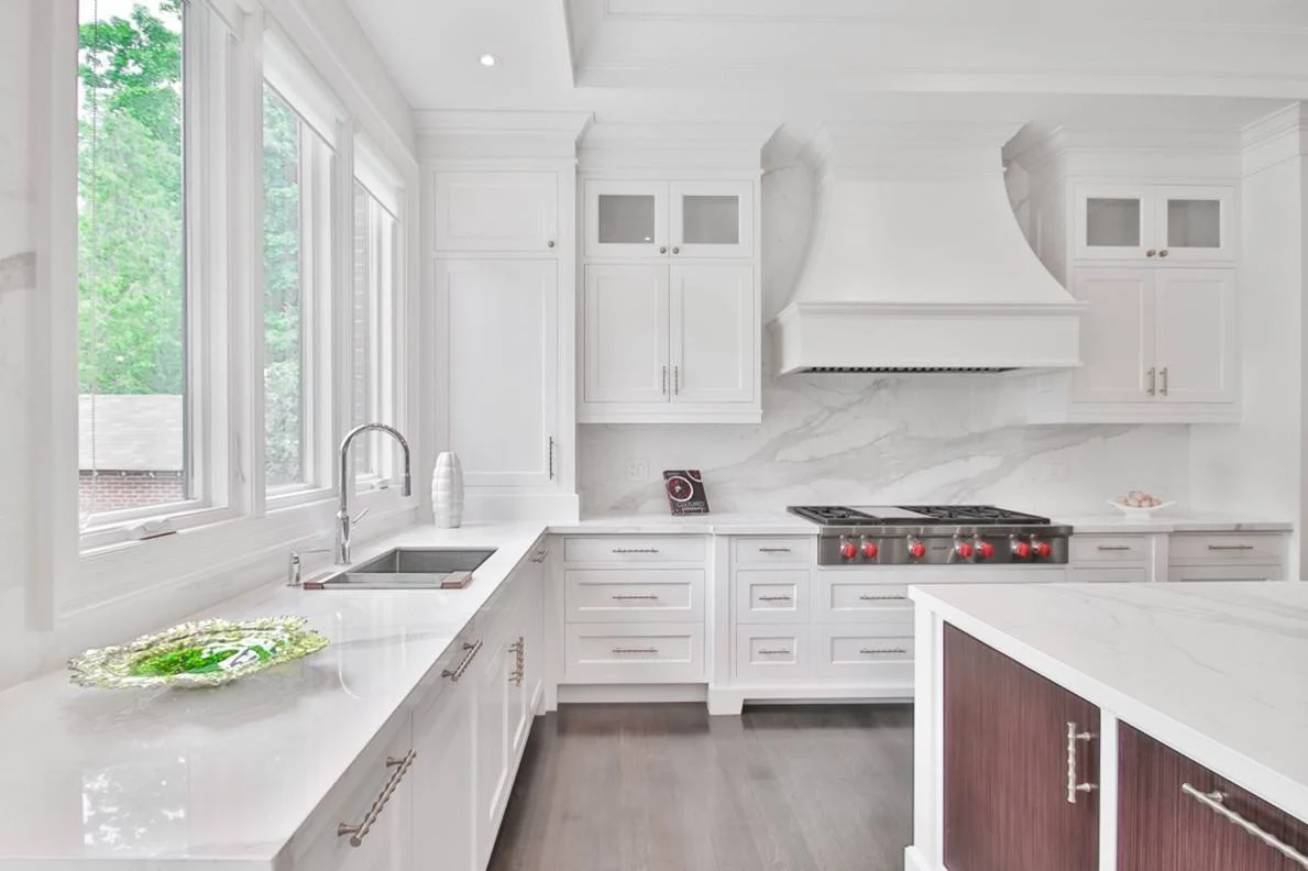
- White Quartz: The ultimate classic. Whether solid, speckled, or elegantly veined, white offers a crisp, versatile foundation. It pairs seamlessly with bold cabinet colours, natural wood, and both ultra-modern and classic traditional designs.
- Grey Quartz: Ranging from cool, silvery hues to warm, deep graphites, grey is the workhorse of design. It brings a contemporary edge while remaining incredibly adaptable, complementing stainless steel appliances and warm brass fixtures with equal ease.
- Beige & Cream Quartz: These tones are the epitome of warmth and comfort. They soften a space, making it feel welcoming and cozy. They are a perfect match for Shaker-style kitchens, rustic farmhouse designs, and any space that aims for a relaxed, organic feel.
3. Making a Statement with Bold Hues
For those who view their kitchen as a stage for design, dark and bold quartz colours are a powerful choice.
Think beyond pure black to rich emerald green, deep navy blue, or burgundy. These colours instantly create a focal point of luxury and drama. A practical benefit: they are excellent at concealing crumbs and minor stains. To prevent the space from feeling too heavy, balance them with light-coloured cabinetry, reflective backsplashes, or metallic hardware for a stunning, high-contrast effect.
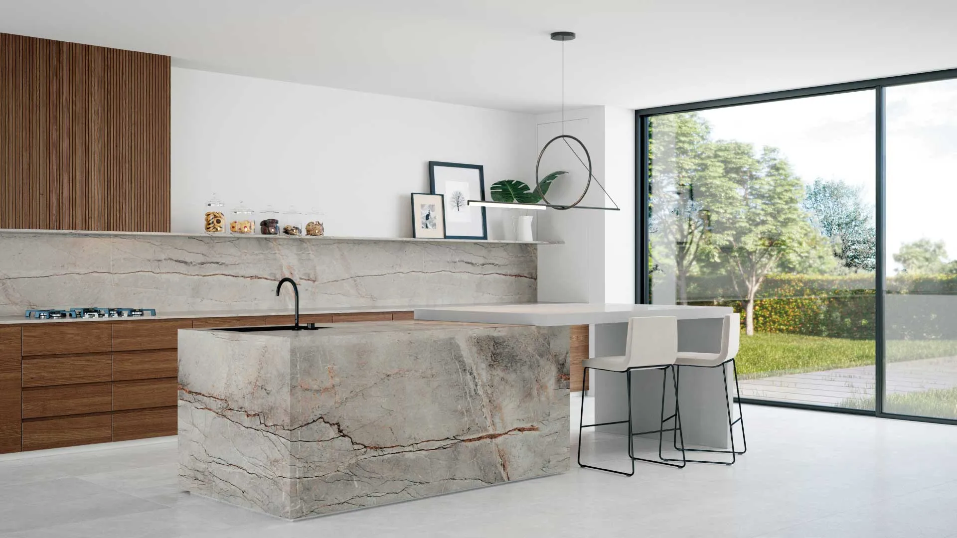
4. The Art of Nature: Veining and Patterns
Quartz Worktop Colour masterfully replicates the breathtaking beauty of natural stone without the high maintenance. The pattern is just as important as the base colour.
- Marble-Inspired: White or grey quartz with soft, flowing veining captures the timeless elegance of Carrara or Calacatta marble, offering a touch of luxury that is durable and stain-resistant.
- Granite-Inspired: Speckled and flecked patterns in tones of black, white, or brown bring the granular, organic texture of granite into your home with superior resilience.
- Bold Veining: Dramatic, large-format veining in contrasting colours (like white on black) creates a true piece of functional art, adding dynamic movement and modern character to your kitchen.
5. The Harmony of Design: Coordinating with Your Space
A beautiful worktop exists in relationship with its surroundings. The key to a cohesive look is harmony and contrast.
- The Monochromatic Look: Create a seamless, modern flow by pairing a grey worktop with grey cabinets in a slightly different tone.
- The Classic Contrast: You can’t go wrong with dark worktops on light cabinets, or vice versa. This timeless combination defines spaces and adds visual interest.
- The Anchoring Neutral: If your cabinetry is a bold colour or a natural wood finish, a neutral worktop (white, beige, or grey) provides a calming anchor that lets the other elements shine.
Pro Tip: Always view large physical samples in your actual space. Observe how the colour changes with the light throughout the day alongside your cabinets and flooring.
6. Practicality Meets Beauty
While aesthetics lead, practicality ensures long-term satisfaction.
- Light Colours: Can show dry debris like crumbs and flour more easily but are simple to wipe clean.
- Dark Colours: Tend to reveal dust, water spots, and streaks more prominently.
- Patterned & Mid-Tone Colours: Are the champions of camouflage, expertly hiding everyday messes between cleanings.
Remember, thanks to its non-porous nature, quartz is resistant to staining across all colour ranges. Your choice should ultimately align with your lifestyle and cleaning preferences.
Your Kitchen, Your Masterpiece
Choosing your quartz worktop colour is a journey of blending personal taste with practical wisdom. Start by defining the emotion you want your space to evoke. Then, let your cabinetry, lighting, and lifestyle guide you towards the perfect shade.
Trust your instinct the right colour will feel uniquely yours. By thoughtfully considering both impact and function, you’ll select a quartz worktop that doesn’t just complete your kitchen but elevates it, delivering joy and beauty for years to come.