A WordPress website redesign doesn’t always need a new visual style.
Sometimes it needs something less glamorous… and way more profitable:
Navigation that makes sense.
Because nothing kills momentum faster than a visitor who wants to take action… but can’t figure out where to go.
If you’re exploring WordPress redesign services, this is one of the first areas worth looking at because navigation is where clarity either happens instantly… or doesn’t happen at all.
Navigation is not a header. It’s your conversion funnel.
Most websites treat navigation like a design checkbox.
But your menu is actually your site’s “choose your path” moment.
People land on your homepage and do one of two things:
- They find what they want quickly and feel in control
- They feel lost and decide it’s easier to leave
And nobody leaves you feedback like, “Hey, your menu was confusing.”
They just disappear.
The 6 navigation patterns that quietly wreck good WordPress sites
1) “Services” becomes a junk drawer
Everything gets dumped under one menu item:
- Services → Website Design
- Services → Website Development
- Services → SEO
- Services → Speed Optimization
- Services → Maintenance
- Services → Consulting
- Services → CRO
On paper, it looks comprehensive.
In real life, it feels like: “I don’t have time to decode this.”
2) Your menu is organized for your team, not your customer
Inside your business, you think in departments.
Visitors don’t.
Visitors think like:
- “I need more leads.”
- “My site is slow.”
- “We’re rebranding.”
- “We’re scaling.”
- “We need this fixed without breaking SEO.”
When navigation is built around your internal structure, visitors end up doing mental work they didn’t sign up for.
3) Your best pages are buried
It’s common to see the pages that actually convert hidden two layers deep.
By the time someone has clicked through “Solutions → Industries → Enterprise → Request quote” they’ve already decided this feels hard.
High-intent pages should be reachable in one click.
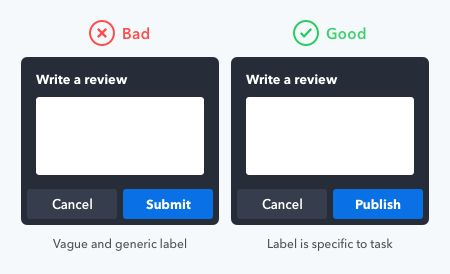
4) Your labels are clever, not clear
If your navigation says:
- “What we do”
- “Explore”
- “Capabilities”
- “The work”
…you may be forcing visitors to guess.
Clear labels convert better than clever ones.
“Pricing” beats “Plans.”
“Case Studies” beats “Success Stories.”
“Contact” beats “Let’s Talk.”
You can still sound premium. Just don’t sound mysterious.
5) Mobile navigation is an afterthought
Even if your desktop menu is tidy, your mobile menu might be a maze.
On mobile, people don’t browse. They scan and tap fast.
If your mobile menu requires:
- too many taps
- deep accordion stacks
- long scrolling inside the menu
…you’re losing people who were ready to act.
6) There’s no obvious “next step”
Navigation isn’t only about pages. It’s also about direction.
If there’s no clear action in the header—no “Get quote,” “Book call,” “Get audit,” “See work”—you’re relying on visitors to figure it out.
Most won’t.
What good navigation feels like
Good navigation doesn’t make visitors think.
It makes them feel:
- “I know where I am.”
- “I know what to click.”
- “This is organized.”
- “These people seem reliable.”
And that last one matters, because people judge your execution based on your structure.
Messy menu → messy delivery (that’s the assumption).
Clean menu → “Okay, they’ve done this before.”
A practical navigation blueprint for a redesign
If you want a simple structure that works for most WordPress sites, start here:
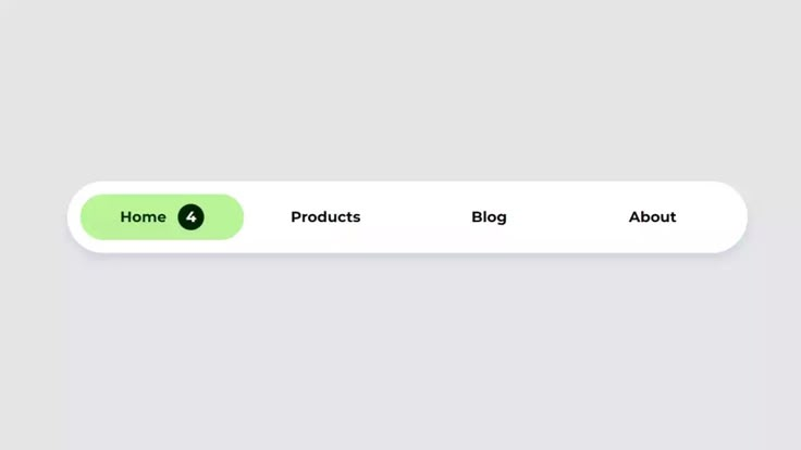
Header menu (left to right)
- Services (3–5 items only)
- Work / Case Studies
- Pricing / Packages (if relevant)
- Resources
- About
- Contact (or a CTA button)
Dropdown rule that saves you from chaos
Instead of listing every service you offer, group by intent:
- Website Redesign
- Speed & Performance
- SEO & Growth
- Ongoing Support
Visitors understand outcomes faster than categories.
Quick self-test: does your navigation need a redesign?
Open your homepage and ask:
- Can a first-time visitor find your main service in one click?
- Do you have more than 7 top-level menu items (excluding CTA)?
- Are dropdowns longer than one laptop screen?
- On mobile, can someone reach Contact in two taps or less?
- Do your labels match words customers actually use?
If you got “no” more than twice, navigation should be a redesign priority.
Navigation redesign isn’t “just UX.” It’s revenue flow.
When navigation improves, these things usually improve with it:
- Better lead quality (people find the right page)
- Higher conversion rates (fewer drop-offs)
- Cleaner internal linking (helps SEO)
- More pages per session (visitors explore instead of escaping)
So if your WordPress website redesign is meant to create results, not just a new vibe navigation deserves real attention.
And if you want someone to treat it like a conversion system (not just a menu cleanup), that’s where working with a WordPress redesign company makes the difference.